Tuesday 28 February 2012

Media Questionnaire

Questionnaire
Gender
Male
Female

Age
16-20
20-30
30+

Which magazine title sounds most appealing?


Thor               Anvil                Meytal     

Are you interested in heavy/rock metal?
Yes
No
If so, what appeals to you most about it?


What do you look for in a music magazine ?


Which of these magazine front covers stand out to you, and why?
1) 

2)

3) 

Monday 27 February 2012

Picture profile- Audience research

Name: Joseph Atkinson (Joe)
Likes: Heavy metal music, reading Metal Hammer, playing guitar
How often do you buy metal magazines? Every month, when they get issued
What do you like about them? I like how they feature and represent different genders
Choose a title for a heavy metal magazine:
Meytal     Anvil     Thor
I like 'Anvil' , it sounds like you've thought about it as a title and it relates well to the heavy metal genre, as a metal fan I would be inclined to buy it as the title sounds different to all the generic names you usually get.

Sunday 26 February 2012

Saturday 25 February 2012

Analysis of front cover (number 1)


1)      This magazine front cover focused mostly on the main image, as it obscures the name of the magazine demonstrating its importance.  The colour scheme is mainly red, yellow and white which is subverting the conventions of most heavy metal/rock magazines as they usually heavily feature the colour black.
The people featured in the image, especially the person at the front all show elements of rebellious clothing and appearance i.e. he is heavily tattooed, has his arms crossed showing a ‘don’t care’ attitude and none of the people are smiling. This all reflects the style and genre of the magazine. The white of the main person’s tee shirt stands out against the rest of the band, signalling him as the lead singer.
The name of the magazine is obscured by the image; however the colour and style of the font stand out against the grey background of the magazine. The name is all in capitals, this establishes the style of the magazine – loud and defiant. All the text follows the same kind of font and none of it looks out of place.This is something I would do in my magazine.

Analysis of DPS no. 5


This double page spread has extremely domineering images as they cover up almost a third of the page, leaving little room for the article. The title also takes up a lot of room on the page, this all represents that ‘My Chemical Romance’ are a very visual band and would rather be seen than read about. The pictures are all in black and white, leaving only the title and the capital M at the start of the article to stand out, prompting a reader to be interested.  The main image is a mid shot of the lead singer of MCR, the way is face is positioned hints at the emotion he feels when doing his job and the non eye connect shows he doesn’t care how’s watching.  The words ‘world exclusive’ in capitals show that the article is a big deal and the colours used show that the magazine has a consistent house style.

analysis of DPS no. 4


This DPS has the most affect on me as I feel like the image is loking straight at me, his has been done purposely so the reader feels this. The colours stand out as they represent blood and the differences in the fonts especially in the title intrigue the reader and make them want to read on. It also gives the general look of the DPS a darker feel to it. The editing on the image has made the model look almost superficial which ties in to the almost surgical theme of the DPS. I like the way that the image has been edited, so when I'm in the editing process for my images, I may adopt the superficial veneer that the singer has, making his skin have a dull shine.

Analysis of DPS no. 3

This DPS looks like it has been took into great consideration. The image is intriguing and makes you want to read about the man featured in it. The title ‘grand designs’ is obviously a play on words and the way that fonts have been used effects the overall view of the DPS greatly. The article has been started with the letter ‘A’ in a font different and of bigger size to the rest, giving the article a mediaeval theme. The fonts used in the title also give this. Even though there is no colour in the DPS, this has obviously been done on purpose for affect and to show ambiguity. I like the way that colour has been left out of this DPS however I don't think I will do this in my final cut.

DPS analysis no. 2


This DPS has a noticeably darker feel to it; this may be because of the band that the article is about. The image is very dark and ambiguous relating probably to the nature of the band featured. In my opinion this DPS does not look very professional as the text is too hard to read and the overall view of the second page is that it is far too sparse. It needs something adding to it. The quite in the middle of the page is good as it makes the page more interesting but I do not think generally it looks very striking.  The image does stand out against the dark background and the colours chosen may represent blood as the band’s name is the ‘murder dolls’. The font is something I owuld take away from this DPS as it realtes to both the genre and the style of the band featured.

Analysis of DPS no.1


The overall look of this DPS is that it’s very organized, however the images give it an edgy feel. The font and the way the article is titled also fits more with the heavy metal genre as the word ‘shredding’ has two meanings which is why the font includes elements of blood. This gives it two dimensions and makes the article stand out. The image on the first page is imposed over the title making it bold and eye catching and the way the pictures have been ‘stuck down’ by masking tape is also different. I like the way that the image on the left side of the DPS has been imposed over the title and I may utilise this feature.

contents page analysis no. 5


 This page follows the same conventions as another one that I have analyses. The page is clean, neat and easy to read. The pictures also have small descriptions under them. I have noticed that the ‘this week’ column is sectioned into different categories’ such as ‘news’, ‘live reviews’. This means that it would be very easy to find what you are looking for and it is something I would consider incorporating into my contents page. I like how the contents page is  not as cluttered as the other ones I have looked atand how the yellow stands out against the black and the reader can pick out important sub headings easier.

Contents page analysis no. 4


This is the most image dominated contents’ page I have looked at and I like this style the best as it showcases the main story with an image and then condenses the rest into words. The fonts are not ones I would choose but I would take away the image dominated style and incorporate it into my own contents page. I like the image dominated style for contents pages the most as the main picture stands out and makes an impression more than if there was lots of smaller images. I am leaning more towards fdoing this style instead of the 'blocky' style for my contents page.

contents page analysis no. 3


This contents page offers a completely different colour scheme and it’s very different to the first two contents pages I have looked at. There is a lot more images than writing in this page however there is small section of writing underneath each one, describing in a few words what it going on. The editor’s note is also considerably smaller however I think it looks better when it’s not as long or taking up too much space. The font is clear although it is not very identifiable with the genre or style.  This page has a more cluttered feel to it, in my opinion there are too many images and not enough writing so I will not be doing this style.

Contents page analysis no. 2

This page differs from the first as it is less image dominated at easier to read. The page is cut in half, one side showing the pages and what’s on them and the other, a note from the editor. Like the first contents page, the colour scheme is red, white and black however it is used more subtly and it it not as ‘in your face’.  The font is less gothic however it is still alternative and identifiably with the style and genre of the music. I like how the contens page has been divided into two, leaving space for a note from the editor, I may use this feature.

Contents page analysis no.1

The page is dominated by big fonts and bold colours. The colours red, white and black from the font colours also relate to the pictures. The picture of Kiss on page 60 on the page will have been deliberately chosen to tie in with the pages colour scheme. It fits in with the conventions of a ‘blocky’ contents page, however it also has a lot of images. This gives it a very ‘crammed’ feel. The fonts used relate to the specific style of heavy metal and they are all gothic.  I have also noticed that the page, although being crammed, it also is very organized. Three different columns show the features, regulars and pictures highlighting the best bits in the magazine. The thing that stands out most to me is that the colours make an impression and the whole page sticks to the same three colours.

Analysis of front cover number 5

The magazine cover is dominated by the colour scheme and the flames that direct the eye towards the name of the magazine and band that is featured in the main article. The image has also been heavily edited so it almost looks like graphic art, the eyes also show fire in them which links the picture to the rest of the layout.
 Although this front cover has been the most edited out of the ones I have analysed, in my opinion it makes the image blend in more to the background than it standing out like the others. The fonts are also the plainest I have looked at as they are all the same colour. The image is obscured by a competition advertisement which draws attention away from the image and feature story.
 The flames obviously draw attention to the feature article and make it stand out, and it also fits in with the heavy metal vibe of the magazine itself. It also creates a theme that will probably link to the theme shown on the DPS. I would use this idea as it gives the pages something to link them all up together

Analsyis of front cover number 4

This cover largely differs from the 3rd covers layout and colour scheme as compared to the one above it could be considered as sparse. The image dominates the cover much more than the writing, which automatically gives importance to the image and the story about it, which is the biggest font on the page and is placed across the image in white and gold, which stands out against the black. The gold used in the man in the images name suggests a big reputation and a higher position over the other stories which are all written in the same smaller grey font.
Once again the main featured on the cover is grimacing and showing of his tattoos and Mohawk hairstyle, giving the message that he is individual and will not fit into a stereotype. His use of facial expressions shows an angry attitude which some can associate with how Metal bands and artists act when performing; they use a lot of anger to express themselves.
The use of different images like the flames signalling the 200th issue of the magazine mark it out as important, and as the cover is so minimalist in it'
The title of the magazine also features the word ‘Metal’ on the H  so already we can see that this magazine is targeted at people who are fans of Metal music. I think this is a good idea as it gives the title a very identifiable feature and it it automatically recognisable

Analysis of front cover number 3


 Compared to the ‘Rocksound’ rock magazine, ‘Metal Hammer’ contrasts greatly. The cover is much more cluttered and confused, making it much harder to read.
 It still follows the conventions that the cover image must be subversive and seem to look angry and very anti commercial. However, he is wearing eye makeup which may suggest that he is subversive and individual which may be saying a wider message about the people who read the magazine. There are also smaller images next to the main features which is different to the ‘Rocksound’ front cover, however none of the images are actual photographs- they are comic drawings. This would reach out to their target market as through my research I have deduced that the audience who read metal magazines also can have an interest in comic and graphic style picture books.
The stories on the front cover include things that people would normally associate with the rock lifestyle, for example: swearing, mentions of rehab/drugs, fighting, prison and breakdowns.  The mention of these things all stick to the conventions of a front cover of a heavy metal magazine. 
The colour scheme consists of a lot of red and black, which stand out against the white background of the image. The fonts used are all different and all are very gothic- sticking to conventions of heavy metal, this is something I would do with my front cover.

Analysis of front cover number 2


2) The front cover is once again dominated by an image that is obscuring the name of the magazine. It focuses more heavily on the colour black which differs from the first cover and sticks more to the conventions of a rock/metal magazine.  The name of the magazine is in the same font as the first cover however the colour of it is different to match more to the colour scheme.
 The band featured on the cover are all in defiant poses and look like they are shouting out from the cover- this ties in with the style of the magazine as it showcases very loud music as a rule. 
 One of the feature articles named at the top of the magazine ‘dangerous days with My Chemical Romance’ uses alliteration to make it trip more easily of the tongue and to make it more memorable and attractive to read.
The cover is very organised in order to be more accessible to the eye and more attractive for potential customers to read, also the colour scheme helps with this as the white gives the effect of more space on the page; making it look far less cluttered. I like the way alliteration has been used as it adds more impact to a title and it's a lot more memorable, I will think about doing this for my front cover. 

Sunday 12 February 2012

Preliminary task evalutation

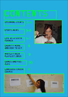
  After analysing the Stephenson magazine I decided that in my opinion it was too dark and the layout was too crammed together to really be succesful. So after taking this into consideration I designed my school magazine to look much brighter and in an altogther neater layout.  I made the magazine layout on InDesign and used tools such as the frame tool to make the overall background and to make each individual text box.
   I chose a font off the website www.dafont.com to make the magazine title look different however it was also relatable as the font is the same one used in the popular teen programme South Park so students can link the to together to give the overall feel of the magazine being modern and 'down with the kids'. The background is blue to tie in with the Whitley Bay High School colours and contrasts well with the colour of the font (black) to make it stand out.
  When taking my pictures I used aperture, the zoom lens and I adjusted the focus noticably in one of the pictures. I also considered composition and lighting whilst taking the pictures and what was going to go into the frame and to what purpose. For example one of the pictures is of a student working with a bunsen burner so I considered where it would be placed and how the light would fall on various objects in the frame.
  When editing my photo's I used Photoshop. I utilised tools such as the clone stamp, the magic wand and the healing brush all to give the photo's a more professional look. Unlike the Stephenson magazine I din't cram all my photo's together in one mural, I put them on the magazine pages spaced out and they were all neatly bordered.
 

Wednesday 1 February 2012

Preliminary Research Work


Research conventions of School Magazine
The students on the front cover of the George Stephenson magazine all look like they are enjoying what they are doing; this gives the impression that the students at the school all take advantage of the opportunities they are presented with.  The whole picture is manipulated to incorporate various images of students among other pictures, all bordered by different aspects of the school to show that within George Stephenson there is a whole host of diverse and different facets to participate in. The layout of the main picture is a star, meant to mirror the school’s ethic or slogan. It paints the students and the school in a good light and gives the students confidence to think of themselves are ‘stars’. The main picture, as well as including students doing various activities, it has also included a vast array of different objects. They have pieces of art work to show off the students talents. The picture in the middle of it all is of the school grounds, saying that at the heart of the students school life and there work is the actual building as it is key for them to have somewhere to learn.  The use of Photoshop instead of using one big picture is meant to reflect the fresh, young look of the school and to show that they use new technology and that the school and students are modern. It is obviously not a traditional school and the whole layout of the magazine shows this.
                As with the Stephenson magazine I will create a big and bold title however in my front page I will make it stand out much more. I will also incorporate a catchy slogan or catchphrase into the front page, however unlike the Stephenson magazine the slogan will be more about the school, not the magazine. The colour scheme of the front page is quite dark and doesn’t inspire any thoughts on the school. They have also photo shopped the tones in the colour scheme to contrast and look darker then they probably were. The effect of this is somewhat uninteresting. My magazine front cover in comparison will be much brighter and have a more stimulating colour scheme.
                I will integrate the issue number and date into the magazine but unlike the Stephenson magazine I will not make it bold and directly under the title as it draws attention away from the main feature. The font used in the contents page relates to ‘graffiti’ and looks young and cool. This appeals to the students reading the magazine and I will utilise this method for my magazine. The picture on the contents page is a thought bubble relating to the school ethics of education, knowledge, asking questions and thinking. The colour scheme is bold and the writing stands out as it is white against a coloured background. The contents page is separated into different categories of ‘Entertainment’, ‘Sport’ and the top articles. They have done this so it’s easier to find a specific article and saves time. Page numbers are central to the contents page so students know which pages to go to, I will also be using this.